Compare CE & PE Premiums Across Strikes — With Stolo’s Options Premium Chart
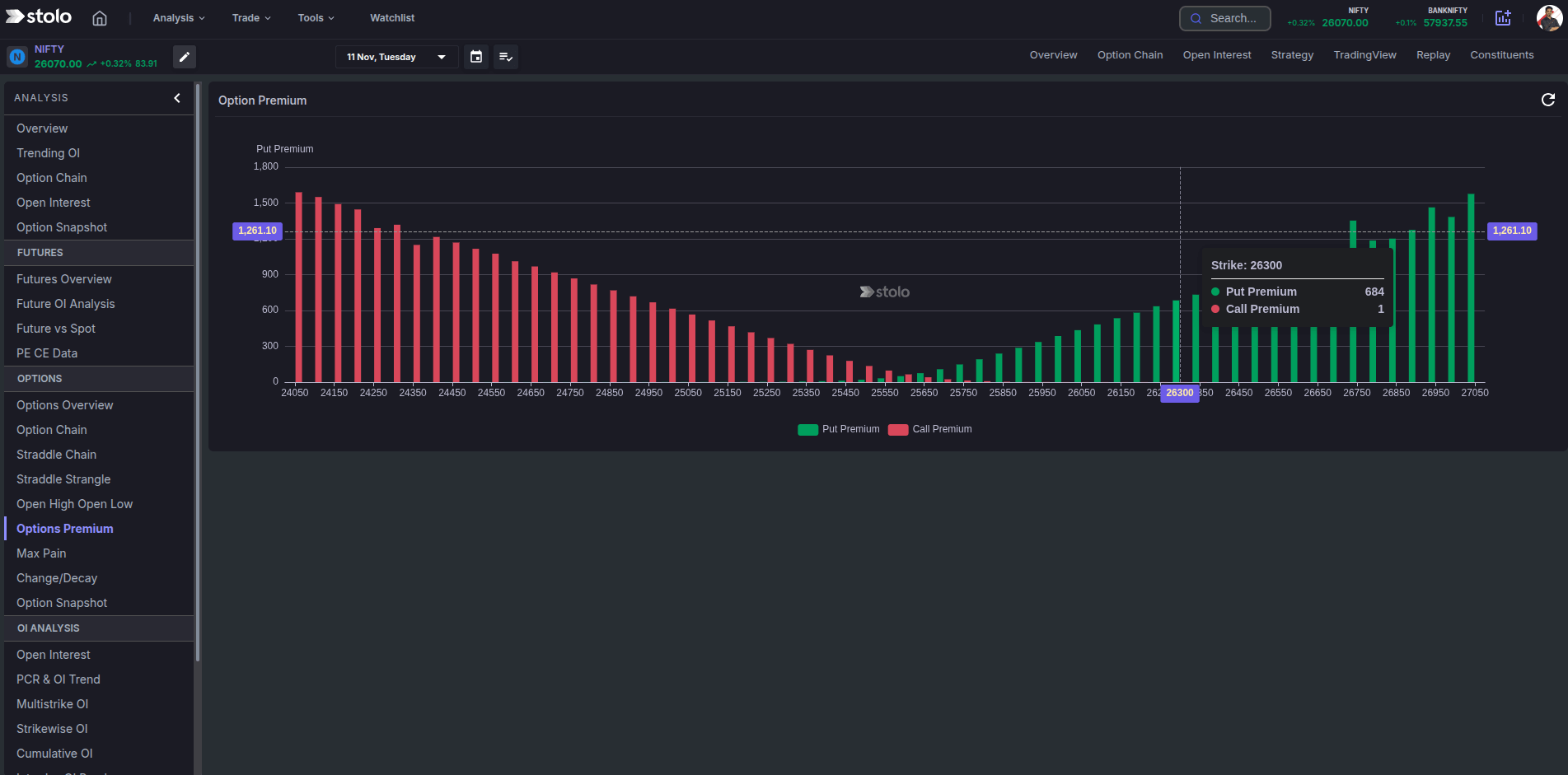
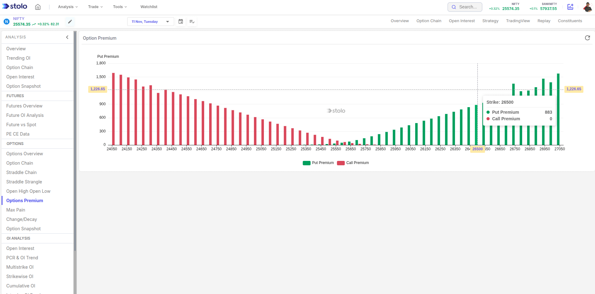
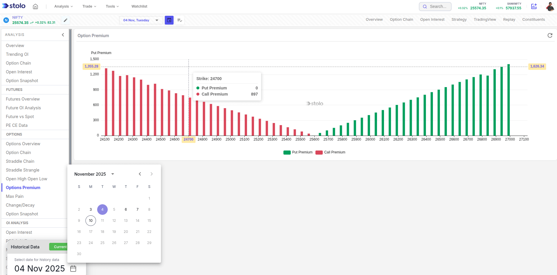
Stop scanning tables. Stolo’s Options Premium Chart plots premium price for PE and CE at every strike for a chosen expiry and index/stock, so you can spot pricing skews, rich/cheap strikes, and opportunity zones at a glance.
Most platforms dump option premiums in text-heavy chains. That makes it hard to:
- Compare CE vs PE at the same strike
- Identify premium skews across all strikes
- Judge which strikes are over/under-priced relative to neighbours
Stolo converts the entire chain into an intuitive visual—so outliers and edges pop instantly.
How to Access Options Premium Chart in Stolo
- Go to Analysis → Options Premium Chart
- Select Instrument (Index/Stock) and Expiry
- Hover any strike to see exact CE/PE premium
- Instantly compare PE/CE premiums for each strike
Frequently Asked Questions
What exactly does the chart plot?
Premium prices of Call (CE) and Put (PE) options for every strike of the selected expiry for an index or stock.
Does it work for stocks as well as indices?
Absolutely. Use it for NIFTY, BANKNIFTY, and top F&O stocks.
Is the data live?
Yes—premiums update in real time during market hours.
Ready to See Premiums the Smart Way?
Open Options Premium Chart in Stolo and surface CE/PE edges instantly.
Start with Trial Plan at just ₹299