Understand Max Pain and How to Read It on Stolo
Ever noticed how the market often gravitates toward a specific strike price near expiry?
That’s Max Pain, the point where the maximum number of option buyers lose and option sellers profit. Stolo makes it simple to see where that level is right now visually, live, and across expiries.
Most traders hear about Max Pain but rarely use it effectively. They know it’s tied to open interest yet finding or updating it manually is a chore.
Without visualization:
- You can't easily see where Max Pain is forming.
- You miss it when it starts shifting intraday.
- You can't confirm how strong the OI distribution is around it.
Introducing Max Pain in Stolo
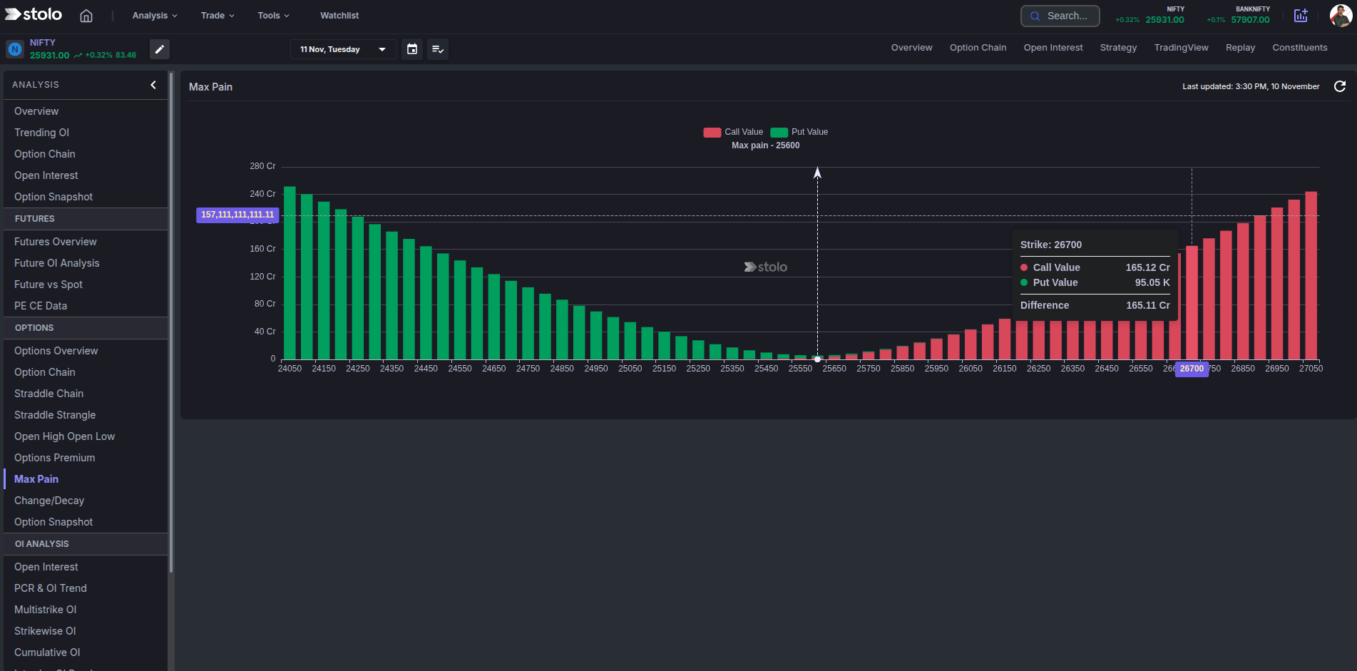
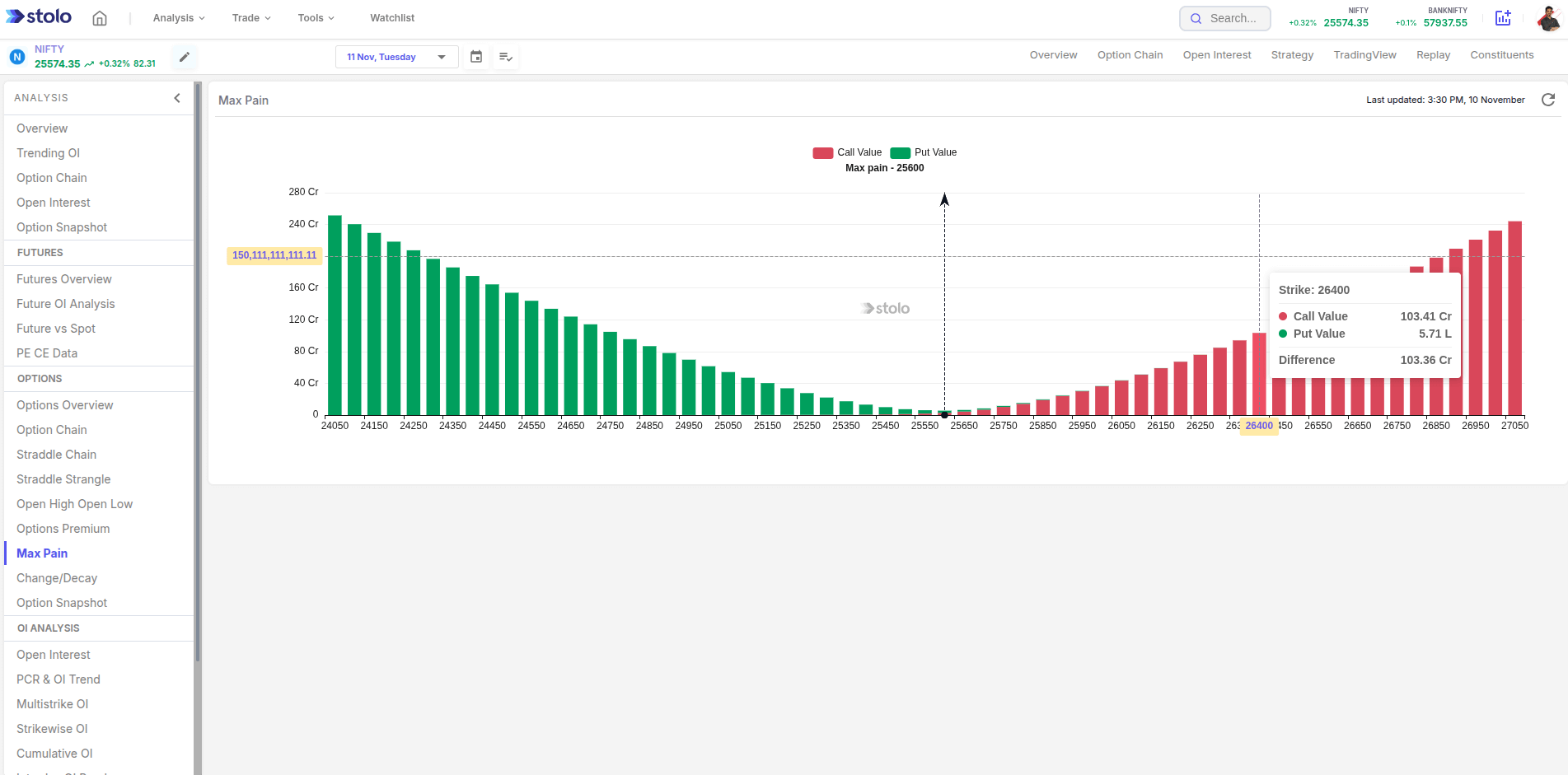
The Max Pain Chart in Stolo calculates and displays the strike where total open interest causes the least loss to option writers.This gives traders an idea of expiry bias and magnet zones the market may be drawn toward.
What you can view:
- Live Max Pain strike for the selected expiry
- OI distribution across all strikes (Call and Put)
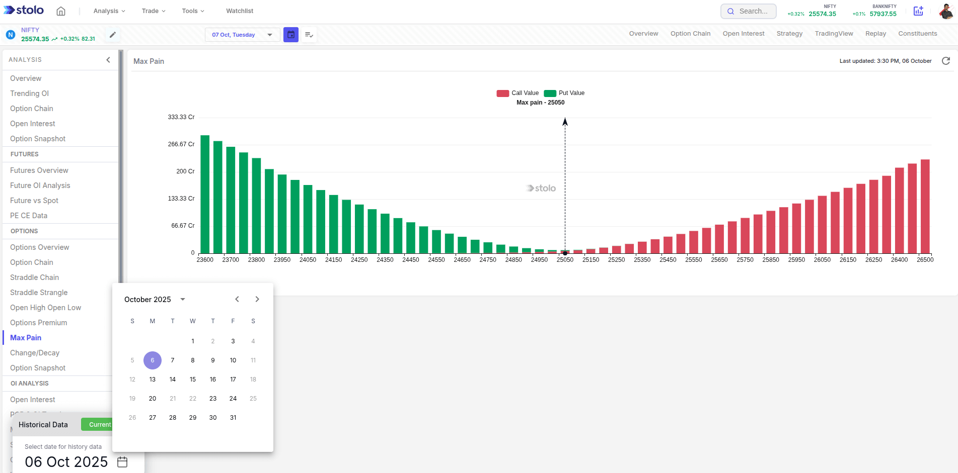
- Historical Max Pain movement during the week
How to Access Max Pain in Stolo
- Go to Analysis → Options → Options Overview
- From the left menu select → Max pain
- Select your instrument (e.g., NIFTY, BANKNIFTY, or stock)
- Choose the expiry date
- The chart plots Call and Put open interest across strikes
- The intersection zone or highlighted strike shows the Max Pain level
- Track how that level shifts intraday or across sessions
Frequently Asked Questions
What is Max Pain in options trading?
How does Stolo calculate Max Pain?
How often does MaxPain get updated in Stolo?
Can I see the historical Max Pain movement?
Is Max Pain always accurate for expiry prediction?
See Expiry Bias in Action, track Max Pain on Stolo
Analyse with the MaxPain chart in Stolo now and visualize how the market positions itself before expiry.
Start with Trial Plan at just ₹299